Case Study
Designing Investment Experience for Trading Beginners
Designing Investment Experience for Trading Beginners
Background
Provide Financial Information & Reliable Analysis Solutions
AASTOCKS.com Ltd. owns one of the largest financial information and analysis solutions platform in Hong Kong. However, with unorganized data and without proactive discovery - it hasn't been optimized for the users. Additionally, our company targeted to more trading beginners use our products, these overwhelm data which may not be an optimal experience to our target users.
Duration
3 months
My Role
Sr. UI/UX Designer
Responsibility
End to end UX/UI design
Impact
+50% Engagement, +30% Trade Conversion
Research
In the early phase of this project, we conducted user research with our target users to identify the core problems and get a sense of how users perceive our product. The followings are what we learned:
Research Insight

Traders express that they can't easily find the one piece of information they need to make a decision when they use M+ Mobile App. Compared to other sites it feels too unorganised and stressful with too much financial jargon.
M+ Mobile App only supports reactive searching, limiting their research and engagement
In general, users don't feel our app could build their financial literacy, leaving users especially beginners stuck in a cycle of dependency and hesitation.
"I don't know which criteria matter" "
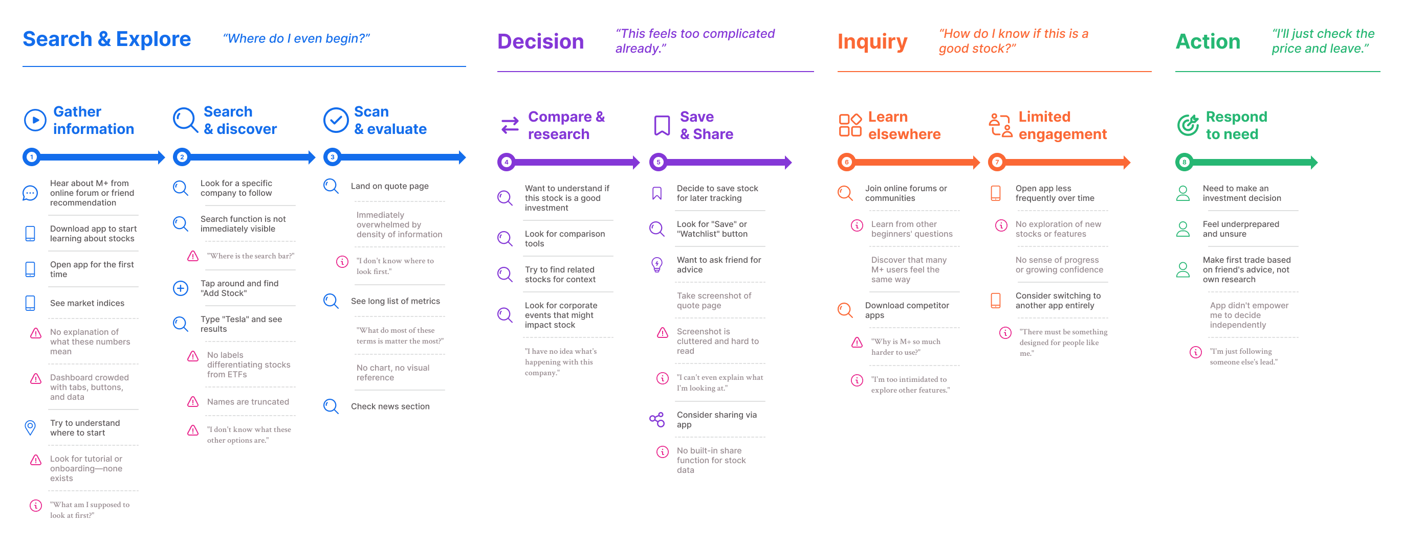
We also worked with the vendor to conduct user interviews, then we consolidated the insights and came up with the investors journey map to help the team better understand the problems.
Research
In the early phase of this project, we conducted user research with our target users to identify the core problems and get a sense of how users perceive our product. The followings are what we learned:
Research Insight
Traders express that they can't easily find the one piece of information they need to make a decision when they use M+ Mobile App. Compared to other sites it feels too unorganised and stressful with too much financial jargon.
M+ Mobile App only supports reactive searching, limiting their research and engagement
In general, users don't feel our app could build their financial literacy, leaving users especially beginners stuck in a cycle of dependency and hesitation.
"I don't know which criteria matter" "
We also worked with the vendor to conduct user interviews, then we consolidated the insights and came up with the investors journey map to help the team better understand the problems.
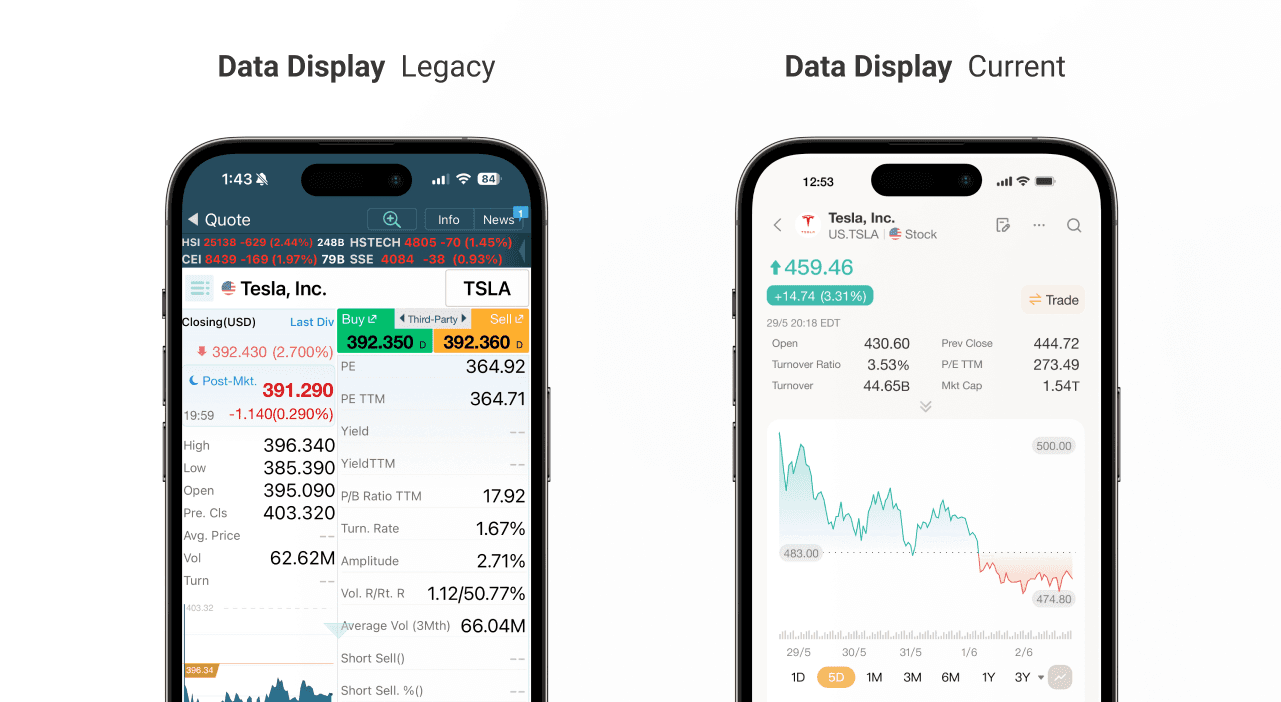
Problem
1. Expert-first design overwhelms beginner traders
M+ was built with a data-first approach, displaying everything a professional trader might want to see on a single screen. It prioritizes comprehensiveness over clarity. However, beginner traders are not equipped to process 20+ technical metrics at once. Terms like "P/E TTM," "B/A Spr," "Vol. R/Rt. R," and "Turnover Ratio" appear without explanation or visual hierarchy. Users cannot distinguish between what is essential and what is advanced. As a result, users become paralyzed by choice and abandon deeper research, using the app only for basic price checks.

2. Search and discovery rely on users knowing exactly what they want
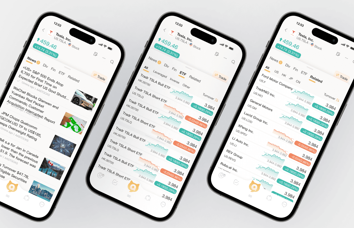
M+ requires users to search by specific stock names or symbols, with no browse-friendly entry points for discovery. When beginners search "Tesla," they see multiple ETFs without differentiation—no curated lists, thematic collections, or beginner suggestions exist to guide exploration.
3. Interface is static and does not support user growth
The information we displayed on the quote page was unstructured and lack of visual hierarchy. Users cannot build financial literacy within the app. They remain dependent on external sources and never progress from passive viewers to confident decision-makers.
Problem
1. Expert-first design overwhelms beginner traders
M+ was built with a data-first approach, displaying everything a professional trader might want to see on a single screen. It prioritizes comprehensiveness over clarity. However, beginner traders are not equipped to process 20+ technical metrics at once. Terms like "P/E TTM," "B/A Spr," "Vol. R/Rt. R," and "Turnover Ratio" appear without explanation or visual hierarchy. Users cannot distinguish between what is essential and what is advanced. As a result, users become paralyzed by choice and abandon deeper research, using the app only for basic price checks.
2. Search and discovery rely on users knowing exactly what they want
M+ requires users to search by specific stock names or symbols, with no browse-friendly entry points for discovery. When beginners search "Tesla," they see multiple ETFs without differentiation—no curated lists, thematic collections, or beginner suggestions exist to guide exploration.
3. Interface is static and does not support user growth
The information we displayed on the quote page was unstructured and lack of visual hierarchy. Users cannot build financial literacy within the app. They remain dependent on external sources and never progress from passive viewers to confident decision-makers.
Hypothesis
Goal
Make complex markets simple, so every beginner can invest with confidence.
Hypothesis
01
Improving the UI/visual design and show more structured information will help investors easier understand stock data.
02
Surfacing comprehensive, all-rounded information will help beginners research more holistically and discover relevant opportunities without leaving the app.
Challenges & Constraints
Balancing data density with simplicity
Financial data is inherently complex, and experienced users expect access to detailed metrics. The challenge was deciding what to keep, what to cut, and what to hide behind progressive disclosure, ensuring beginners aren't overwhelmed while power users still find the depth they need.
Technical constraint
M+ was built with rigid data structures and display components that made it difficult to reorganize information or introduce new visual layouts. Redesigning required working within these constraints while advocating for backend changes to support a cleaner, more structured presentation.
Hypothesis
Goal
Make complex markets simple, so every beginner can invest with confidence.
Hypothesis
01
Improving the UI/visual design and show more structured information will help investors easier understand stock data.
02
Surfacing comprehensive, all-rounded information will help beginners research more holistically and discover relevant opportunities without leaving the app.
Challenges & Constraints
Balancing data density with simplicity
Financial data is inherently complex, and experienced users expect access to detailed metrics. The challenge was deciding what to keep, what to cut, and what to hide behind progressive disclosure, ensuring beginners aren't overwhelmed while power users still find the depth they need.
Technical constraint
M+ was built with rigid data structures and display components that made it difficult to reorganize information or introduce new visual layouts. Redesigning required working within these constraints while advocating for backend changes to support a cleaner, more structured presentation.
Principles
The following principles are what I complied when I was designing the new experience:
01
Clear
Financial data is complex, but the interface shouldn't be. Every screen should prioritize readability by establishing clear visual hierarchy, using plain language labels, and eliminating unnecessary jargon. Beginners should grasp the most important information within seconds, not minutes.
02
Contextual
Stock data alone is meaningless without surrounding context. The design should bring together all relevant information—news, performance trends, corporate events, and related stocks—into a single, scannable view. Users should never have to leave the page to understand the full picture.
03
Guided
Beginners don't always know what they're looking for. The experience should gently guide them toward relevant stocks through curated recommendations, "users also watched" sections, and intuitive entry points for exploration: making discovery feel natural rather than overwhelming.
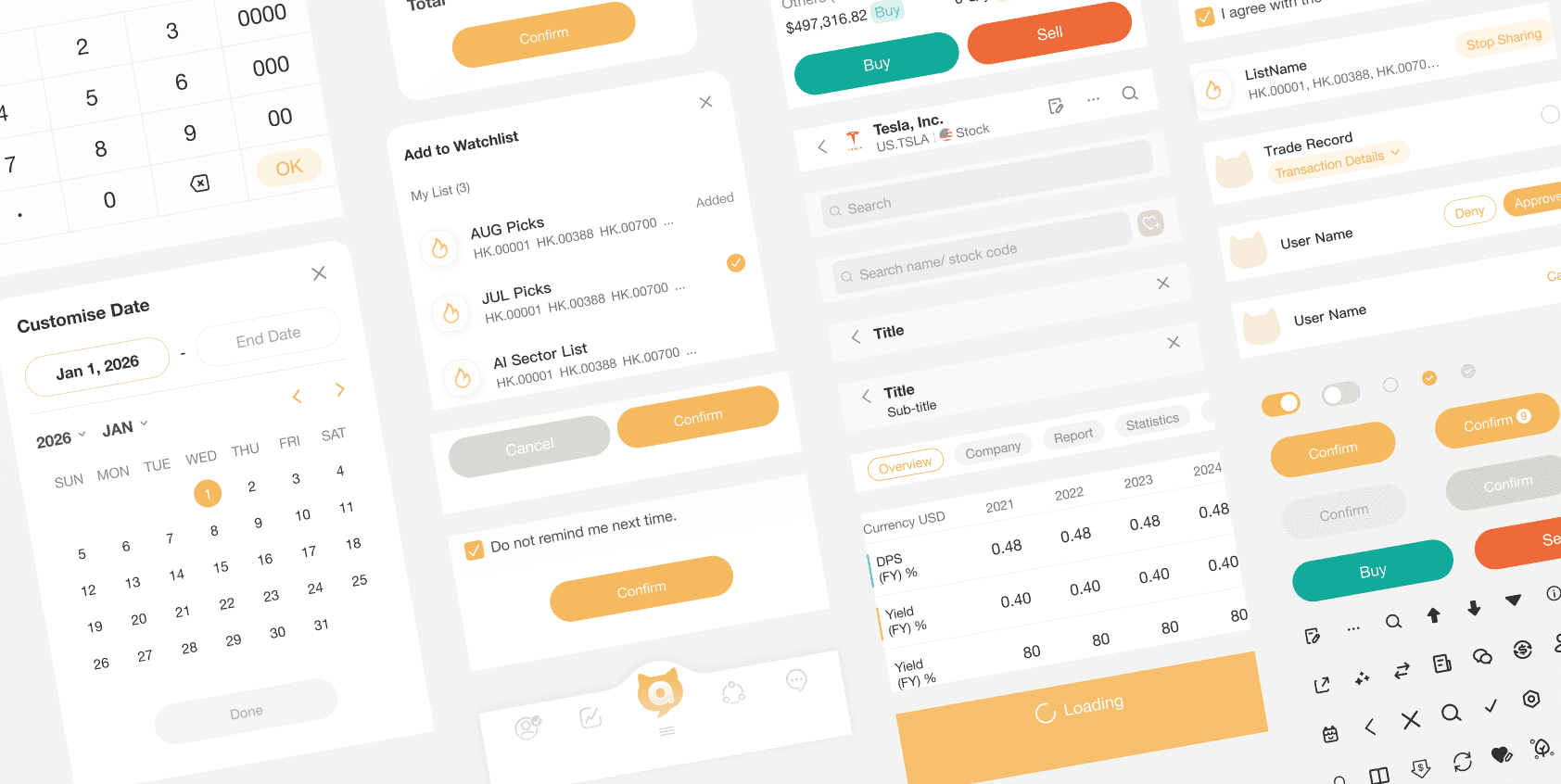
These are our components in our shared design library that allow designers in the team to use to keep the consistency.
Principles
The following principles are what I complied when I was designing the new experience:
01
Clear
Financial data is complex, but the interface shouldn't be. Every screen should prioritize readability by establishing clear visual hierarchy, using plain language labels, and eliminating unnecessary jargon. Beginners should grasp the most important information within seconds, not minutes.
02
Contextual
Stock data alone is meaningless without surrounding context. The design should bring together all relevant information—news, performance trends, corporate events, and related stocks—into a single, scannable view. Users should never have to leave the page to understand the full picture.
03
Guided
Beginners don't always know what they're looking for. The experience should gently guide them toward relevant stocks through curated recommendations, "users also watched" sections, and intuitive entry points for exploration: making discovery feel natural rather than overwhelming.
These are our components in our shared design library that allow designers in the team to use to keep the consistency.
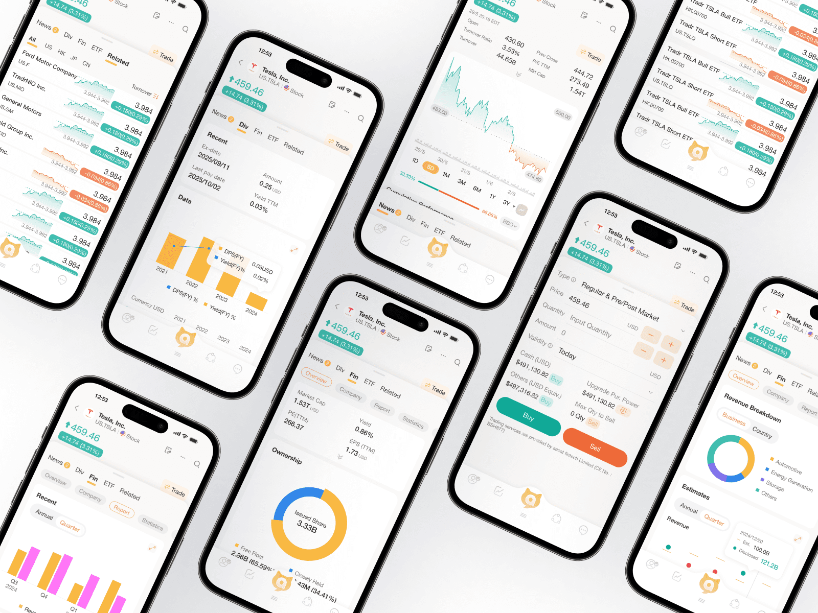
Design Deliverables
Here are the key initiatives we've launched in MVP and some following improvements:
From data dump to clear sections
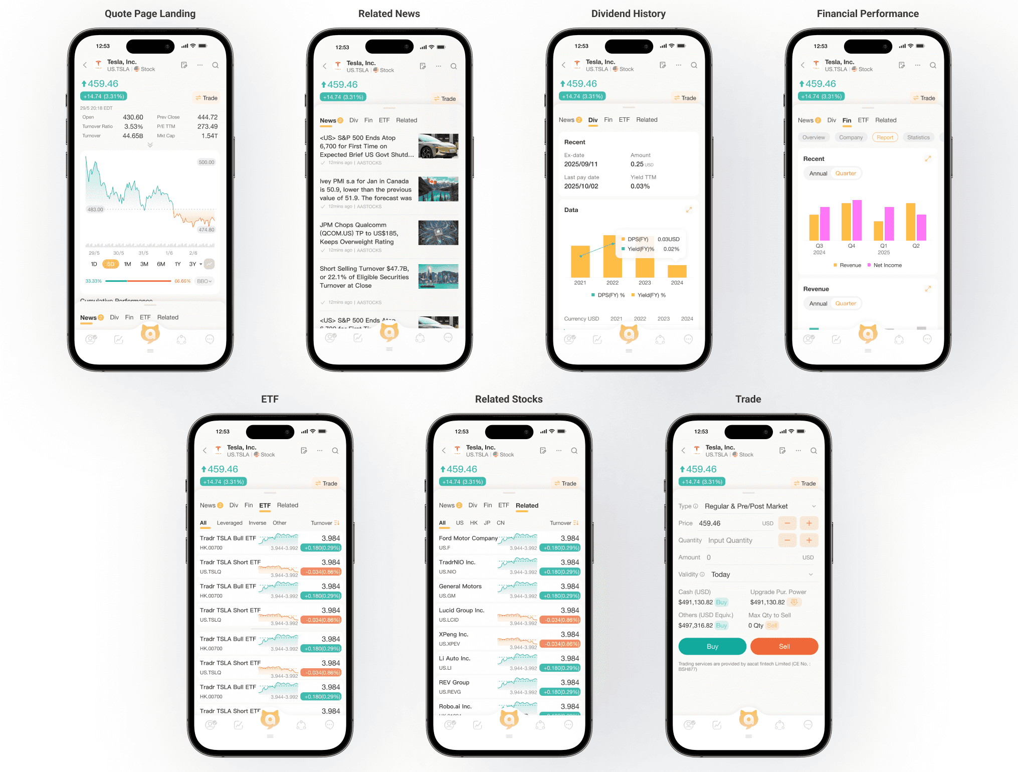
For a very long time, M+ displayed every possible data point on a single screen, leaving beginners overwhelmed and unable to distinguish what mattered. This is not how a new investor should start their research journey. As one of the primary changes in the redesign, we wanted to introduce a more approachable way to consume financial information, which led us to reorganize the entire quote page into distinct, scannable sections. Users can now see the stock price and daily change prominently at the top, followed by key metrics, cumulative performance, corporate events, related stocks, and news—each in its own dedicated block with clear headings. We created a logical flow that guides the eye from the most critical information to supporting context.

Due to technical constraints, we were not able to fully customize every metric label for the MVP, but we prioritized the most essential data points and grouped them intelligently to reduce cognitive load. After MVP launch, we will continue refining the data hierarchy based on user feedback.
Bringing context to the surface with related stocks and corporate events
One of the most frequent requests from beginner users is understanding how a stock fits into the bigger picture—what else should they look at, and what's happening with the company. Because traditional quote pages only show raw numbers, users had to jump between multiple screens and external sites to piece together a complete story.

We introduced two new context-rich sections directly on the quote page: "Corporate Action" showing upcoming events like dividends and earnings dates in a simple timeline format, and "Users also watched" displaying related stocks that other investors are viewing. These additions help users discover new opportunities and stay informed without leaving the page. Our goal is to provide all-rounded information that turns a static quote page into a dynamic research hub. By surfacing corporate events and related stocks, beginners can research more holistically and make connections they might otherwise miss.
Making performance visual and scannable
We redesigned how cumulative performance is presented to make it instantly understandable. Previously, users faced a dense table of percentages without any visual reference point. We replaced the complex table with simple horizontal bar charts that show performance at a glance. Each time period now has a visual indicator of positive or negative performance, making trends immediately obvious. The bar length and color communicate magnitude and direction without requiring users to interpret raw numbers first.

Since space is limited on mobile, we wanted to let users quickly assess a stock's trajectory before diving into details. The visual bars work alongside the key percentages, giving both an intuitive overview and precise data for those who need it. After MVP launch, we plan to add comparative benchmarks (like vs. industry or index) to provide even more context.
Design Deliverables
Here are the key initiatives we've launched in MVP and some following improvements:
From data dump to clear sections
For a very long time, M+ displayed every possible data point on a single screen, leaving beginners overwhelmed and unable to distinguish what mattered. This is not how a new investor should start their research journey. As one of the primary changes in the redesign, we wanted to introduce a more approachable way to consume financial information, which led us to reorganize the entire quote page into distinct, scannable sections. Users can now see the stock price and daily change prominently at the top, followed by key metrics, cumulative performance, corporate events, related stocks, and news—each in its own dedicated block with clear headings. We created a logical flow that guides the eye from the most critical information to supporting context.
Due to technical constraints, we were not able to fully customize every metric label for the MVP, but we prioritized the most essential data points and grouped them intelligently to reduce cognitive load. After MVP launch, we will continue refining the data hierarchy based on user feedback.
Bringing context to the surface with related stocks and corporate events
One of the most frequent requests from beginner users is understanding how a stock fits into the bigger picture—what else should they look at, and what's happening with the company. Because traditional quote pages only show raw numbers, users had to jump between multiple screens and external sites to piece together a complete story.
We introduced two new context-rich sections directly on the quote page: "Corporate Action" showing upcoming events like dividends and earnings dates in a simple timeline format, and "Users also watched" displaying related stocks that other investors are viewing. These additions help users discover new opportunities and stay informed without leaving the page. Our goal is to provide all-rounded information that turns a static quote page into a dynamic research hub. By surfacing corporate events and related stocks, beginners can research more holistically and make connections they might otherwise miss.
Making performance visual and scannable
We redesigned how cumulative performance is presented to make it instantly understandable. Previously, users faced a dense table of percentages without any visual reference point. We replaced the complex table with simple horizontal bar charts that show performance at a glance. Each time period now has a visual indicator of positive or negative performance, making trends immediately obvious. The bar length and color communicate magnitude and direction without requiring users to interpret raw numbers first.
Since space is limited on mobile, we wanted to let users quickly assess a stock's trajectory before diving into details. The visual bars work alongside the key percentages, giving both an intuitive overview and precise data for those who need it. After MVP launch, we plan to add comparative benchmarks (like vs. industry or index) to provide even more context.
Outcome
We A/B tested each new feature to make sure we see a positive impact on business and user side then merge them back to our core MVP foundation.
+
0%
0%
Engagement rate
+
0%
0%
Trade Conversion
+
0%
0%
Return Visits within 7 days
As a result, this new search experience redesign was very positive in terms of many aspects, it massively increased the critical business metrics as well as the user engagement.
For a full design process showcase,
For a full design process showcase,
For a full design process showcase,